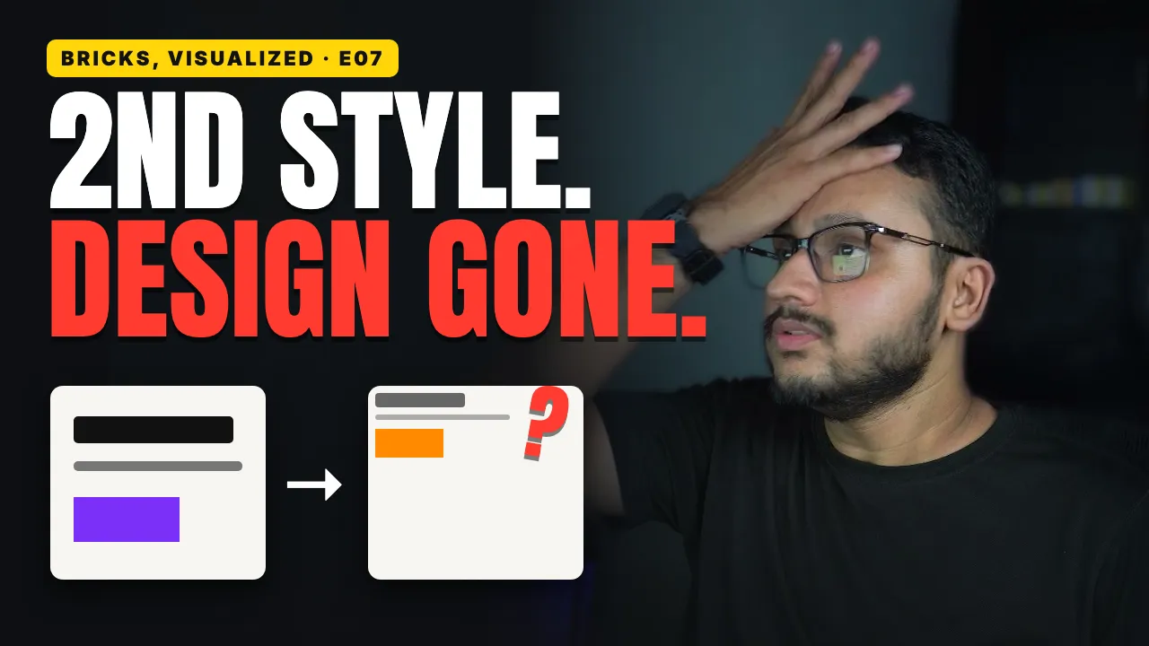

You make a heading smaller on a tablet, and your phones change too, even though you never touched them. Then you make it bigger on desktop, and the tablet ignores you completely.
It looks random, but Bricks builder is following one simple rule.
What you'll learn
Why a value you set on tablet reaches both phone sizes, and which way it never travels
Why a change on desktop can skip right over your tablet, and how to make the tablet follow again
What the grey and white values in the panel are telling you, and what the dots above the toolbar icons mean
What happens to the other three sides when you change just one side of the padding
Which breakpoint to stack a row on so that one change fixes both phone sizes, and why you should also check the widths between the four sizes
Where a tablet value is saved when a class is selected, and where a Theme Style keeps its own breakpoint icons
Why a field can say 40 while the heading doesn't change at any size, and the two-step fix
What mobile first really flips, and why it's a decision for the very start of a project